RGB
Proton
- Joined
- Nov 12, 2016
- Messages
- 234
- Nebulae
- 570
yes, hello
@RGB
You've gone for something similar to what rotoscoping looks like in animation if you drew this (I don't want to say traced but that's it in essence), and didn't just use some filters, it's very clear to see, and it's a valid technique despite what some people say about it, but it does have the tendency to be immediately recognisable as a style and look like filters, leading to doubt when it's presented. It's a great way for a learning artist to get good with several techniques, often learning the tools and styles they can play around with rather than sheer expression.
The issue mostly is that it's too flat. There's no variation in shade and tone to show, and I can see a few big areas where it shows the most. These are the Omniwrench and Ratchet's face. The wrench is a block of colour, and the snout of the face has zero depth.
You could overcome a lot of this sort of trouble by considering changing the style some to your own, play around, see if you can't find something that fits you. With that you could achieve a more you style and effect, more immediately recognisable.
For a first time it's good. Very good. Your colour work is good and your shading and blending is pretty okay too, and can become even moreso, but it's far too obvious it's not built on your own style and that it's basically drawn directly over a reference image and that's what kills it through and through if you want it to be anything more than a persoanl pet project or practice. That lack of creativity, individuality, and stylistic expression greatly detracts from it.
"But scnonc, what does you meant?"
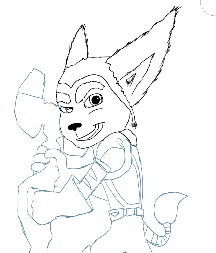
First off, that's not my username anymore, and second off, here's a quickie example of me drawing the same image, the same pose, but in a more unique style, which immediately serves to make this more my own from a creator's standpoint. I couldn't be bothered to finish it but I trust it helps illustrate the point how much of a difference imprinting your own style can change it and make it your own.
And here's a tease as to what I've been working on personally
Reactions:
List