Completed [Competition] Art of The Week

Status
Not open for further replies.

Dicknose

Whatever happens, happens.
Joined
Oct 11, 2016
Messages
2,048
Nebulae
1,632
is anyone even reading these headlines


@Dicknose, I take it that this is your final submission. Both here and in the previous pose your biggest problem was lighting, it feels really flat here, like you'd use only one lamp on each character and put it in front of them. Try to use more lights and put them on various angles towards the character in question, it will make shadows and feel just absolutely better. It has a neat concept though and both of the characters match correctly. Neato


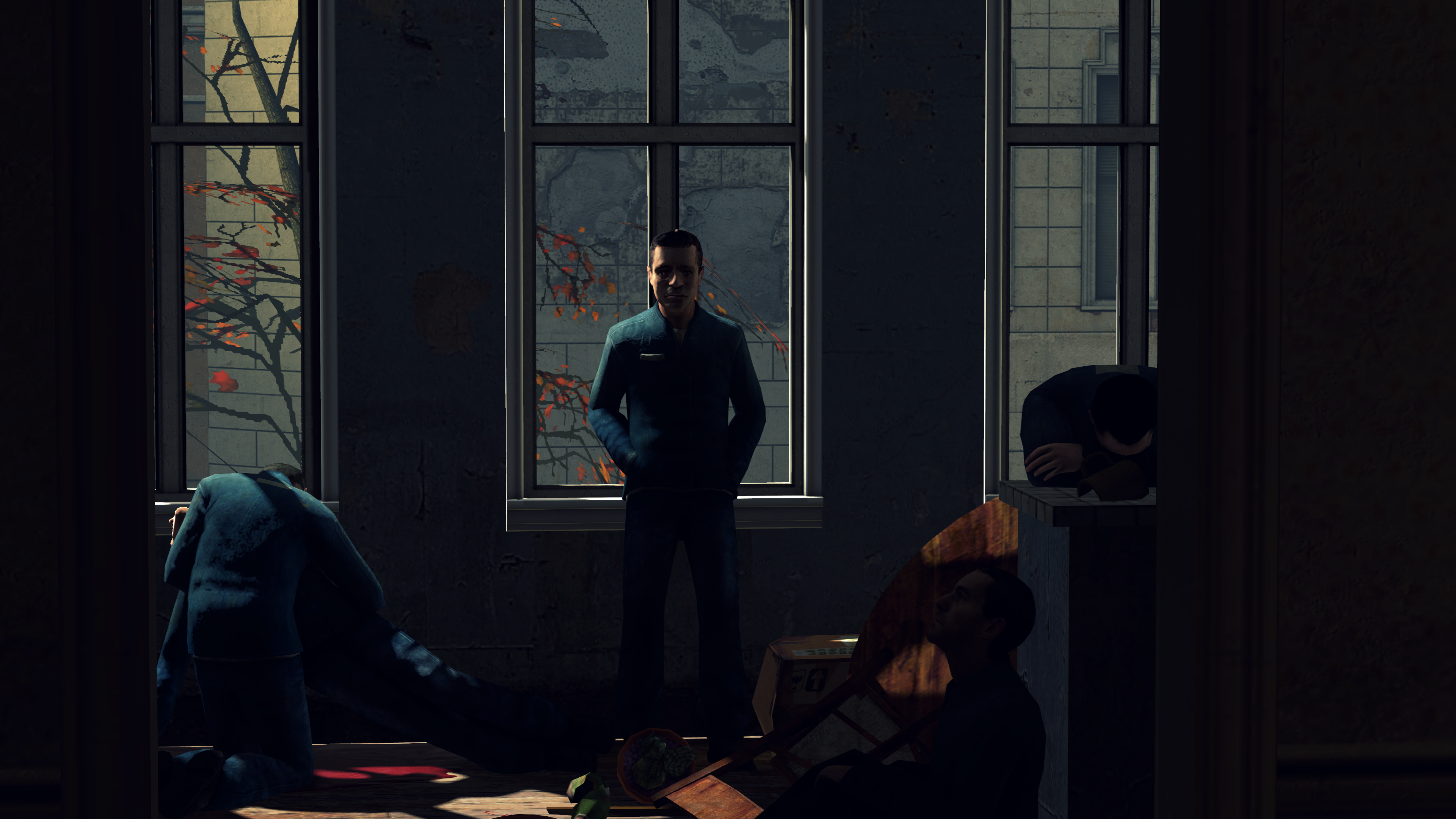
@Heck, yeah, like you said, bloom is the problem here. That mattress is so fucking white, that I'd be surprised if it hasn't joined the KKK yet. Despite that though, everything else is just right, even though the walls are very bare. I'd just turn down the light, maybe even make it minimal so that this place would feel like a rathole it is. Pretty nice concept, would love to see it develop overtime


@Jer, something I'd see as a poster in a roleplay document. Not necessary a bad thing, but yeah, there is a lot to improve if you'd want it to be a wallpaper, even though it has it's style. If you were aiming for making this one look like a photo though, you did it quite well, as it feels very much like a real one. GG


@goose, take your
thumbup1.gif
and leave, you're destroying all the newcomers


@liew, same as above,
thumbup1.gif


@RGB,
thumbup1.gif
, show it to us when you finish it


@Supersoup, they're pretty much just screenshots with a little bit of editing, but I like where you're going. It has sort of a portrait look in it, and if you'd edit it with that in mind, it could look very decent. The only real problem here is how low resolution these models are, which I think you can guess how to fix. I honestly wish you best of luck with this kind of art, as portraits are one of the hardest formats to pull off with a decent result. I'd love to see more of your work though, keep them coming man


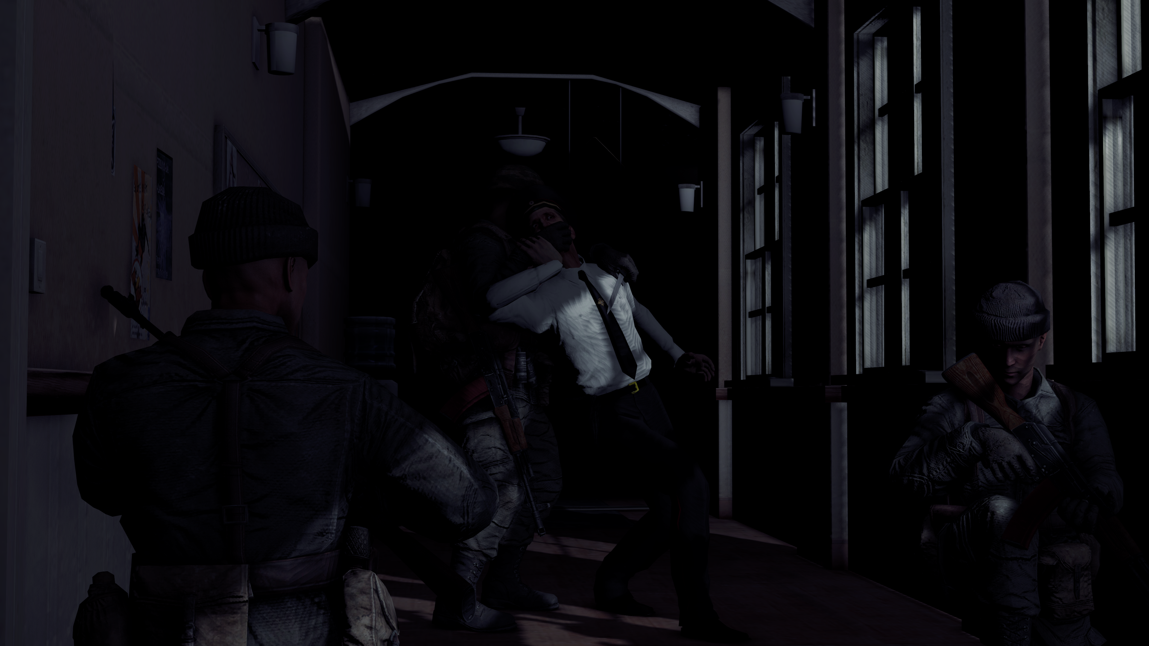
@zigbomb, pretty nice pose for just being a meme. I honestly like how dynamic it is, even if most of the animations here are ripped from HL2. Also, this here is a perfect example of a properly filled up pose, love it.
thumbup1.gif
to you fam

3 wins, 1 honorary, go go go

@Mickey Toast

9StFDNL.jpg


@Wolfaye™


@Viper0419

lfwsxp.png


And as for the lonely honorary, it's @Maxim

broken10e1_by_leviticus2-dc17nfy.png


Nice work fams, these artworks are beautiful
My Luke one was my submission. I was just updating that anakin one
 

lemon

Sells cheap beer
Joined
Apr 26, 2016
Messages
1,426
Nebulae
3,434
My Luke one was my submission. I was just updating that anakin one
Well, I have pretty much the same comment to it. The only thing I can add is that I prefer the one without the triangle
 

Piggo

Electron
Joined
Jan 24, 2018
Messages
513
Nebulae
680
Do we post our own offering or does someone post what they liked the most this week?
 

Piggo

Electron
Joined
Jan 24, 2018
Messages
513
Nebulae
680
Considering that she's technically a head on an extremly long neck because thats a headswap, her body being about 2 feet away, i would not reccomend that. The SIG on the right however is rather.....

*loads-cartridge*

.....special
 

Maxim

Proton
Joined
Apr 26, 2016
Messages
214
Nebulae
226
unpolished and probably not the most original concept - to be honest, I don't really like this one but thought I may aswell submit it.
tempo4e1_by_leviticus2-dc1dz53.png
 
Reactions: List

Viper0419

Neutrino
Joined
Jan 14, 2018
Messages
43
Nebulae
114
nlgxua.png


yeah... I'm starting to lose inspiration, send some professional help before I descend into the big depression

edit: I realised the blur was pretty weird looking, so I removed the blur
 
Last edited:
Reactions: List

lemon

Sells cheap beer
Joined
Apr 26, 2016
Messages
1,426
Nebulae
3,434
I guess not


@goose, it's quite easy to make something like that, pretty much just some horizontal movement on that train and that's it. However, I like how you edited it, even if it's very subtle. It looks like one of those animations that look like they're for children, but they actually can be enjoyed by everyone. Idk, I like it, it just needs polishing and maybe more stuff happening around, like birds flying away at the sound of the train passing by, you know what I mean. Either way, cool stuff

@Hamilton, this here is a great example of what good lighting and editing can make. No offense, but both camera and posing here is really bad, but what you did with these lights and colors really makes me enjoy looking at this piece. You could've obviously removed this rubble near the cops, as lighting is messed up on it, but other than that these aspects are just spotless. This is a really good thing for you, because both lighting and editing is usually the hardest thing to learn and sometimes it doesn't come early, or in a fancy shape. Posing and camera angling on the other hand is something that you will learn eventually, overtime, you just need to practice. The only advice I can give to you is to watch movies, comics and other forms of visual art as well as your own body. The last word might've sounded weird, but when you're posing, it's best to form yourself into the position you want your character to be, and see which move is more natural and comfortable, which muscle does what, etc. Good luck fam,
thumbup1.gif


@Maxim, honestly, it's not that bad. As you said, it needs some polish, but it's not that shabby. I'd maybe zoom in a little bit more, positioning these guards behind. It's decent, but could be better. Still,
thumbup1.gif


@Viper0419, need inspiration? Watch some from this and this. Come back shortly fam, posing is nothing less than taking a single frame from a movie, so you better watch some movies to get pumped up

So ye, two winnerinos:

_how_on_earth_do_i_use_this_thing____by_autismopiggo-dc1qdd1.jpg


@Piggo you seem to have something for facial expressions, not only here but in your other artwork too. Neat lighting too, just a bit too much on this girl here

927cd7515c5a.jpg


@maga, just ye


See you all in 8 days
 

Piggo

Electron
Joined
Jan 24, 2018
Messages
513
Nebulae
680
Thanks m8
Yeah that lightings a bit off, I'm gettin better at it though in sfm, just need some more practice this week.
 
Reactions: List

Hamilton

Proton
Joined
Dec 23, 2016
Messages
412
Nebulae
192
@Hamilton, this here is a great example of what good lighting and editing can make. No offense, but both camera and posing here is really bad, but what you did with these lights and colors really makes me enjoy looking at this piece. You could've obviously removed this rubble near the cops, as lighting is messed up on it, but other than that these aspects are just spotless. This is a really good thing for you, because both lighting and editing is usually the hardest thing to learn and sometimes it doesn't come early, or in a fancy shape. Posing and camera angling on the other hand is something that you will learn eventually, overtime, you just need to practice. The only advice I can give to you is to watch movies, comics and other forms of visual art as well as your own body. The last word might've sounded weird, but when you're posing, it's best to form yourself into the position you want your character to be, and see which move is more natural and comfortable, which muscle does what, etc. Good luck fam,
thumbup1.gif
Thank you so much @Lemon Cuntcake I really like this thread and whenever I have time I try doing some poses and stuff I feel happy in doing it to post here! I will try improve my techniques as your advice told me to, thanks!
 
Reactions: List
Status
Not open for further replies.