- Joined
- Apr 26, 2016
- Messages
- 3,019
- Nebulae
- 10,413

\Steam\steamapps\common\GarrysMod\garrysmod\screenshots\gm_black_v30005.jpg)

Despite it's half silly, half pretty serious look - this is really well made pig. Lighting on the grass and bushes is pretty good and each model's lighting is in sync as well. With some extra depth of field it would even look like a gmod menu wallpaper. Nice stuff pigger.Thanks Danny
back to gmod

reason for blue and red lights.
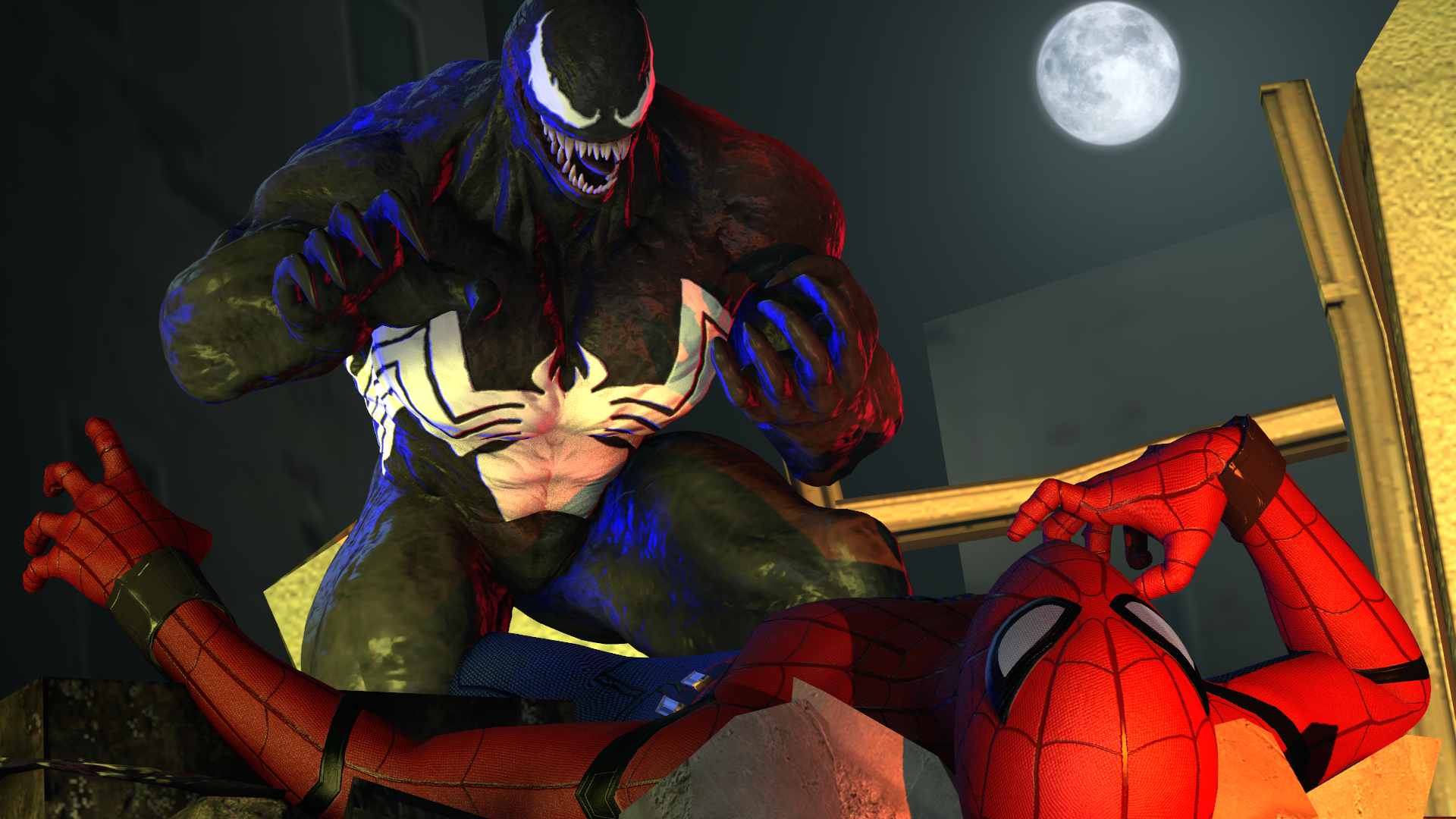
1990s venom from the Cartoons
Might remove them to be HONEst
Though there isn't very much going on in the pose, the lighting and motion of movement does make up for it in a way. And it's better to picture the tones of light as you showed the context behind it but it's still pretty bland, doesn't look like much is going on. As for the painting, it has some pretty colours and nice gradient composition - even though it's from a film. I think it'd be cool to see more painting around here to be honest. Try some conceptual stuff just to get used to paints if you decide to stick with it.I painted this
Now this, this confuses me greatly. I can't tell if it's evening, or night time with burning buildings forming the light around two thirds of the picture or something. I thought those sharp things behind the sign was ricochets from the helicopter that I thought was firing, but then I realised how calm the two guys look and thought they were trees? So what's actually happening? I think if the lighting was a little simpler it'd be identifiable. In future I'd pursue some simpler lighting techniques, because that guy to the left of the fire should be totally visible but ain't.ok havent done this in a while

This is pretty nice to look at, fairly creative for what it is but when it's this simple it can be hard to really convey anything. But since you used some semiotic impulse, the heart is quite enough. Y'should try implementing some more emotion in simple things like just some simplenot really expecting to win, just want criticism tbh
got inspiration from something, decided to try it myself for a e s t h e t i c s

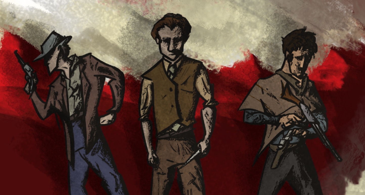
I think I'm witnessing the humble beginnings of something here, but lemme give some pointers. The only person that looks remotely human in the way they're moving (or posed) is the man with the buzz saw on his shoulder so you should practise some more walking poses, especially on slopes.
Moving the MG up to the front line. Circa 1943, colorized.
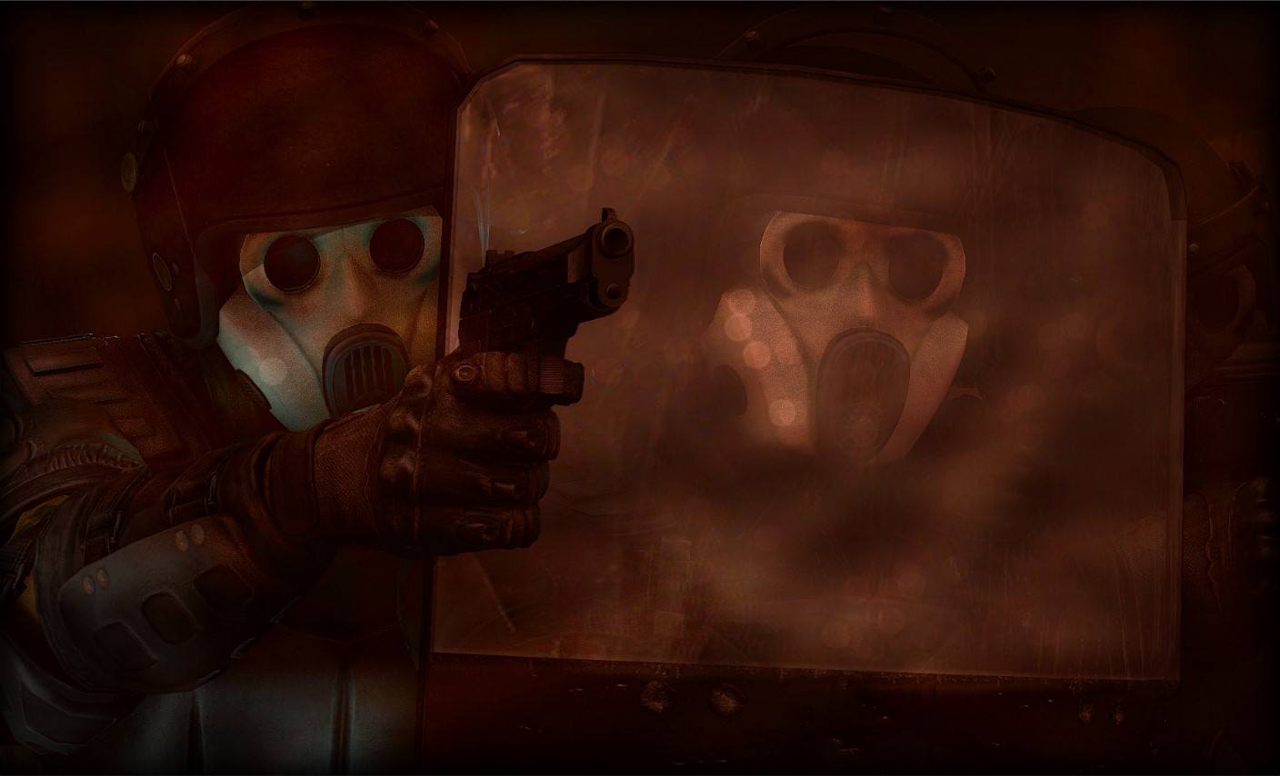
I could describe this picture with the word intense, as it should be. I like the way you had included the second riot gear man on the right too - something about it is very scenic and well put together. Editing is top notch too, I like the little lens flares on the shield, gives some good depth to the image.
I like all three of these drawings you've put forward, my favourite is the first one ("Will it Last TV guy"). Something about how smooth those lines are and the small amount of colour on the hands is such a cool style, wish I could do something like that and it's more of a style I'd like to see.
And

dunno if i i already posted this one tho

Idk what you were goin for here bucket but I know you can do better, it's a bit comedic I'll give you that but it doesn't make much sense either.HL2RP is a.... well it's a... well uhhh... donate for premium.
Even though you don't like how it turned out, I did. It looks so incredibly simple and natural, I thought it was an actual screenshot from the HL2 campaign or something. I'm guessing that wasn't your aim but that's what I think. As for improving it, I'd go with adding something more in the background than just some bushes and fences and it doesn't have to be complicated. If it's sandy and says no entry, I kinda assume antlions, so just a thumper would add more to it. DOF does seem a little off but I think it does in a nice'ish way. Keep up the work friend, you're on the right tracks.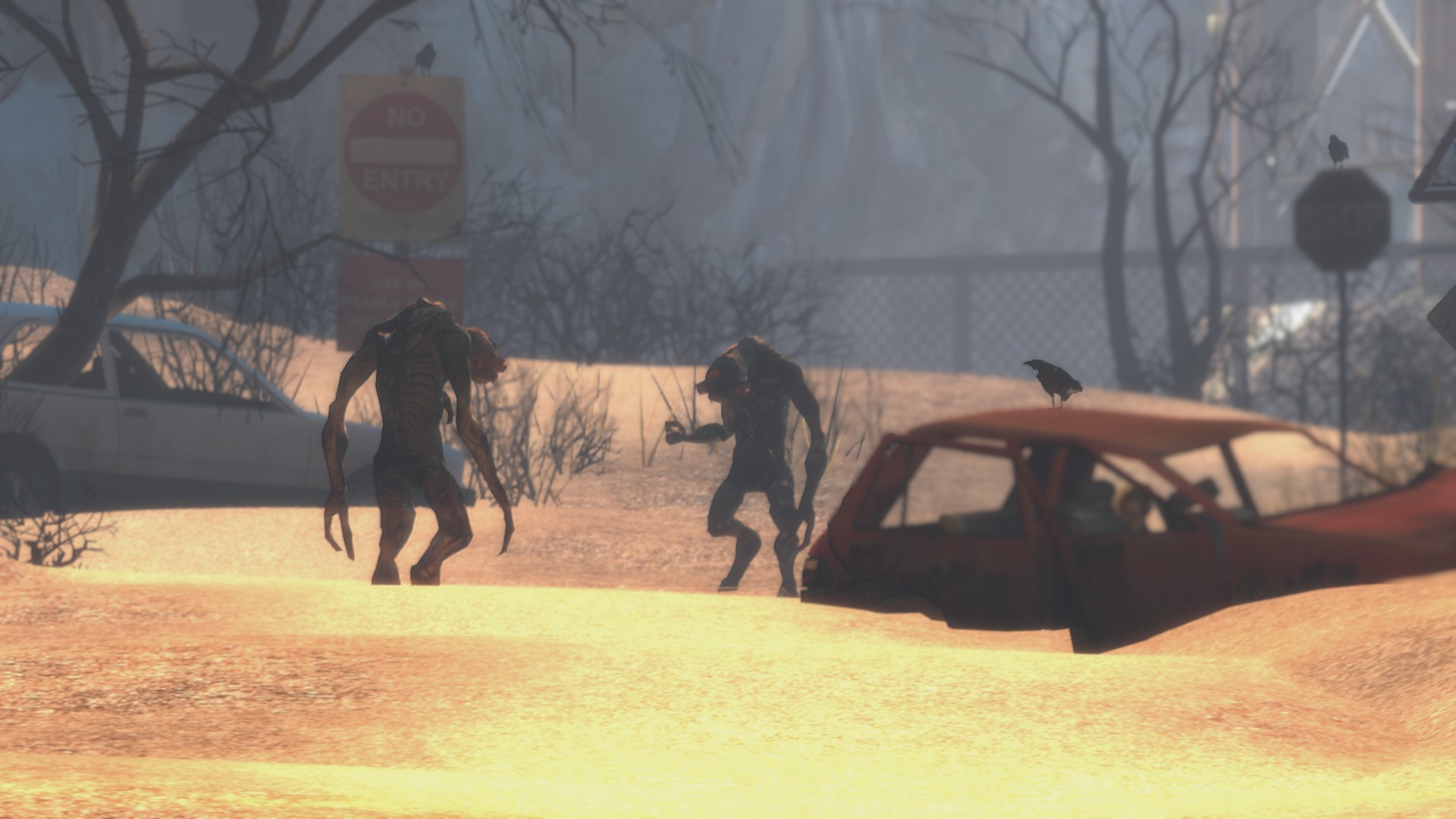
i don't like the way this turned out
Interesting character, I'll give you that. But one thing you're really missing out on is shading/lighting. It looks so incredibly flat without any of it. Also work a bit more on body proportions maybe, the wrist looks as if it's the same width as her(?) whole arm, fingers are spread out pretty far too. But I'm just nit picking at this point. Keep it up.

Might've posted this here in the past, Not too sure.
Either-way, this is my week's entry!
I think you had posted the first one once, or maybe on your own thread, but it was so long ago that it usually wouldn't be counted since lemon would only take recent art usually. Stops people from just posting their entire catalogue one week at a time, anyways...changing yours?
changing mine

Not only is this pretty sick, it's metal as fuck. Since it's for your school work I reckon there's some good context behind the choices you've made which just make it more intriguing. I hope you add more colour to the guys in the background or something, looks like pastel?? So might be some good shading opportunity. Keep up the good work, post it somewhere if you finish it, since your post implies you're still doing it. I'm interested.
Just a piece I was doing for my arti project in school, of my brother. No, he isn't injured in real life, this is just for the project, looks sick though.
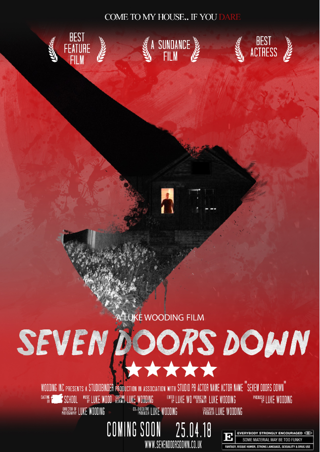
This is pretty cool, some good little cliché nods to other film posters but I do have some notes to add. Please don't change
Something about this style, so cool. So unbelievably fun to look at and it suits the mood you'd expect to see in HL2 terms of living (this is the kind of message I'm getting from it atleast). My particular favourite of the two being the first, as the creases in the jumpsuit look so awesome with the watercolour kind of overlay. Is this even digital or scanned in? regardless, good work. Can't wait to see more some day soon.
wowowowow

havent posed in a while so why not get back into the jig of things with a generic army man pose
changing my entry

CAN YOU REVIEW TRANQULITY BASE HOTEL AND CASINO I HEAR YOU ARE A FELLOW FANI RETURN ONCE MORE
as per @Lemon Cuntcake's request.
Let's begin.
Though there isn't very much going on in the pose, the lighting and motion of movement does make up for it in a way. And it's better to picture the tones of light as you showed the context behind it but it's still pretty bland, doesn't look like much is going on. As for the painting, it has some pretty colours and nice gradient composition - even though it's from a film. I think it'd be cool to see more painting around here to be honest. Try some conceptual stuff just to get used to paints if you decide to stick with it.
Now this, this confuses me greatly. I can't tell if it's evening, or night time with burning buildings forming the light around two thirds of the picture or something. I thought those sharp things behind the sign was ricochets from the helicopter that I thought was firing, but then I realised how calm the two guys look and thought they were trees? So what's actually happening? I think if the lighting was a little simpler it'd be identifiable. In future I'd pursue some simpler lighting techniques, because that guy to the left of the fire should be totally visible but ain't.
This is pretty nice to look at, fairly creative for what it is but when it's this simple it can be hard to really convey anything. But since you used some semiotic impulse, the heart is quite enough. Y'should try implementing some more emotion in simple things like just some simpletypographytext can change a whole image. It's important for things to have meaning, even if it's just contextual. I like your style, don't be afraid to dream a little bigger than this though.
I think I'm witnessing the humble beginnings of something here, but lemme give some pointers. The only person that looks remotely human in the way they're moving (or posed) is the man with the buzz saw on his shoulder so you should practise some more walking poses, especially on slopes.
The postures of the other two seem to contort a little from side to side as well. It's kind of odd how two people are totally relaxed but that guy on the left has seen some danger of some kind, or it's implied atleast - try to make people a little more intense when doing military poses I'd say.
The way the guys are spread out is pretty well balanced and easy to read from either direction that they're moving somewhere - so you got the context down without needing that text below anyways. Work on that motion blur, and nice work friendo.
I could describe this picture with the word intense, as it should be. I like the way you had included the second riot gear man on the right too - something about it is very scenic and well put together. Editing is top notch too, I like the little lens flares on the shield, gives some good depth to the image.
I like all three of these drawings you've put forward, my favourite is the first one ("Will it Last TV guy"). Something about how smooth those lines are and the small amount of colour on the hands is such a cool style, wish I could do something like that and it's more of a style I'd like to see.
Second one is a nice illustration too, makes me think she's a happy kind of girl which I'm taking from just the smile, if you haven't put together from the rest of my reviews, colour is pretty important to me too - people can smile and that's nice, but if they're in all black clothing is it a real smile? If they're in colourful clothing, is it a genuine smile? But with b/w colours it's just ' she's happy'. Still nice. Add some colour in future I'd say, even if it's a simple amount like on the first drawing.
As for the last, it belongs in a graphic novel of some kind. So many different personalities and styles put into such a fantastic collage of characters. Can only imagine how long this could've taken you but it's still very unique, and so well shaded too. Beautiful work friend keep it up.
Idk what you were goin for here bucket but I know you can do better, it's a bit comedic I'll give you that but it doesn't make much sense either.
Even though you don't like how it turned out, I did. It looks so incredibly simple and natural, I thought it was an actual screenshot from the HL2 campaign or something. I'm guessing that wasn't your aim but that's what I think. As for improving it, I'd go with adding something more in the background than just some bushes and fences and it doesn't have to be complicated. If it's sandy and says no entry, I kinda assume antlions, so just a thumper would add more to it. DOF does seem a little off but I think it does in a nice'ish way. Keep up the work friend, you're on the right tracks.
Interesting character, I'll give you that. But one thing you're really missing out on is shading/lighting. It looks so incredibly flat without any of it. Also work a bit more on body proportions maybe, the wrist looks as if it's the same width as her(?) whole arm, fingers are spread out pretty far too. But I'm just nit picking at this point. Keep it up.
I think you had posted the first one once, or maybe on your own thread, but it was so long ago that it usually wouldn't be counted since lemon would only take recent art usually. Stops people from just posting their entire catalogue one week at a time, anyways...
This is a nice picture of good old Gman, I like the way the grass/moss centres in like a cyclone to a burst of light and the silhouette, it's also pretty neat how that grass picks up light from it too, adds a lot of depth to it, especially with the amount of volume it carries. It doesn't really need much improvement, as side from some indication of what the elusive man was doing there but yet again, we never really know much about him. So the picture remains as much of a mystery. Nice work, John.
Not only is this pretty sick, it's metal as fuck. Since it's for your school work I reckon there's some good context behind the choices you've made which just make it more intriguing. I hope you add more colour to the guys in the background or something, looks like pastel?? So might be some good shading opportunity. Keep up the good work, post it somewhere if you finish it, since your post implies you're still doing it. I'm interested.
This is pretty cool, some good little cliché nods to other film posters but I do have some notes to add. Please don't changetypefaceso often. Really weird how it goes from arial/calibri text to sketchy looking design. You gotta pick a certain flow and stick with it. If you find if difficult I got some good techniques, either find a slimmer version of your title font, or make the letters smaller and split them up with a kerning tool, or spaces, either works.
MY WINNER THIS WEEK - @goose
Something about this style, so cool. So unbelievably fun to look at and it suits the mood you'd expect to see in HL2 terms of living (this is the kind of message I'm getting from it atleast). My particular favourite of the two being the first, as the creases in the jumpsuit look so awesome with the watercolour kind of overlay. Is this even digital or scanned in? regardless, good work. Can't wait to see more some day soon.
Try and make a png version of graffiti in this style - could get it added in the HL2 map somewhere maybe? An optimistic project, but could be hella cool.
HONORARY WIN - @liew (no media dev wins allowed).
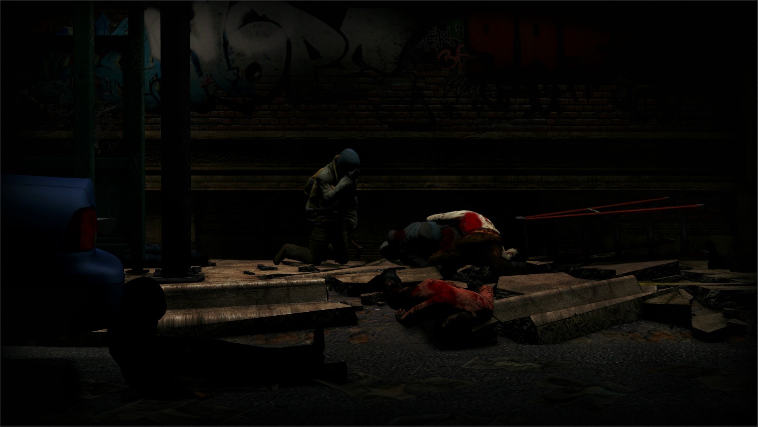
Not gonna lie buddy, that first picture was pretty weak, I've seen better from you before and I hoped you'd change your entry and you did. The lighting in that second picture is just too good for words but I'mma just compliment how well that small blur works on that light and how it really shows some desperation from the seemingly wounded or even dying soldier. Top notch scene build.
---
Good job this week guys, hope this was a decent judgement with some useful feedback, I hope it was seen as fair to you. It's late and I got university tomos which is why I've posted this early, have a good week fellas :^))
my post was more of an inside joke. I'll do a better one this week!I RETURN ONCE MORE
as per @Lemon Cuntcake's request.
Let's begin.
Though there isn't very much going on in the pose, the lighting and motion of movement does make up for it in a way. And it's better to picture the tones of light as you showed the context behind it but it's still pretty bland, doesn't look like much is going on. As for the painting, it has some pretty colours and nice gradient composition - even though it's from a film. I think it'd be cool to see more painting around here to be honest. Try some conceptual stuff just to get used to paints if you decide to stick with it.
Now this, this confuses me greatly. I can't tell if it's evening, or night time with burning buildings forming the light around two thirds of the picture or something. I thought those sharp things behind the sign was ricochets from the helicopter that I thought was firing, but then I realised how calm the two guys look and thought they were trees? So what's actually happening? I think if the lighting was a little simpler it'd be identifiable. In future I'd pursue some simpler lighting techniques, because that guy to the left of the fire should be totally visible but ain't.
This is pretty nice to look at, fairly creative for what it is but when it's this simple it can be hard to really convey anything. But since you used some semiotic impulse, the heart is quite enough. Y'should try implementing some more emotion in simple things like just some simpletypographytext can change a whole image. It's important for things to have meaning, even if it's just contextual. I like your style, don't be afraid to dream a little bigger than this though.
I think I'm witnessing the humble beginnings of something here, but lemme give some pointers. The only person that looks remotely human in the way they're moving (or posed) is the man with the buzz saw on his shoulder so you should practise some more walking poses, especially on slopes.
The postures of the other two seem to contort a little from side to side as well. It's kind of odd how two people are totally relaxed but that guy on the left has seen some danger of some kind, or it's implied atleast - try to make people a little more intense when doing military poses I'd say.
The way the guys are spread out is pretty well balanced and easy to read from either direction that they're moving somewhere - so you got the context down without needing that text below anyways. Work on that motion blur, and nice work friendo.
I could describe this picture with the word intense, as it should be. I like the way you had included the second riot gear man on the right too - something about it is very scenic and well put together. Editing is top notch too, I like the little lens flares on the shield, gives some good depth to the image.
I like all three of these drawings you've put forward, my favourite is the first one ("Will it Last TV guy"). Something about how smooth those lines are and the small amount of colour on the hands is such a cool style, wish I could do something like that and it's more of a style I'd like to see.
Second one is a nice illustration too, makes me think she's a happy kind of girl which I'm taking from just the smile, if you haven't put together from the rest of my reviews, colour is pretty important to me too - people can smile and that's nice, but if they're in all black clothing is it a real smile? If they're in colourful clothing, is it a genuine smile? But with b/w colours it's just ' she's happy'. Still nice. Add some colour in future I'd say, even if it's a simple amount like on the first drawing.
As for the last, it belongs in a graphic novel of some kind. So many different personalities and styles put into such a fantastic collage of characters. Can only imagine how long this could've taken you but it's still very unique, and so well shaded too. Beautiful work friend keep it up.
Idk what you were goin for here bucket but I know you can do better, it's a bit comedic I'll give you that but it doesn't make much sense either.
Even though you don't like how it turned out, I did. It looks so incredibly simple and natural, I thought it was an actual screenshot from the HL2 campaign or something. I'm guessing that wasn't your aim but that's what I think. As for improving it, I'd go with adding something more in the background than just some bushes and fences and it doesn't have to be complicated. If it's sandy and says no entry, I kinda assume antlions, so just a thumper would add more to it. DOF does seem a little off but I think it does in a nice'ish way. Keep up the work friend, you're on the right tracks.
Interesting character, I'll give you that. But one thing you're really missing out on is shading/lighting. It looks so incredibly flat without any of it. Also work a bit more on body proportions maybe, the wrist looks as if it's the same width as her(?) whole arm, fingers are spread out pretty far too. But I'm just nit picking at this point. Keep it up.
I think you had posted the first one once, or maybe on your own thread, but it was so long ago that it usually wouldn't be counted since lemon would only take recent art usually. Stops people from just posting their entire catalogue one week at a time, anyways...
This is a nice picture of good old Gman, I like the way the grass/moss centres in like a cyclone to a burst of light and the silhouette, it's also pretty neat how that grass picks up light from it too, adds a lot of depth to it, especially with the amount of volume it carries. It doesn't really need much improvement, as side from some indication of what the elusive man was doing there but yet again, we never really know much about him. So the picture remains as much of a mystery. Nice work, John.
Not only is this pretty sick, it's metal as fuck. Since it's for your school work I reckon there's some good context behind the choices you've made which just make it more intriguing. I hope you add more colour to the guys in the background or something, looks like pastel?? So might be some good shading opportunity. Keep up the good work, post it somewhere if you finish it, since your post implies you're still doing it. I'm interested.
This is pretty cool, some good little cliché nods to other film posters but I do have some notes to add. Please don't changetypefaceso often. Really weird how it goes from arial/calibri text to sketchy looking design. You gotta pick a certain flow and stick with it. If you find if difficult I got some good techniques, either find a slimmer version of your title font, or make the letters smaller and split them up with a kerning tool, or spaces, either works.
MY WINNER THIS WEEK - @goose
Something about this style, so cool. So unbelievably fun to look at and it suits the mood you'd expect to see in HL2 terms of living (this is the kind of message I'm getting from it atleast). My particular favourite of the two being the first, as the creases in the jumpsuit look so awesome with the watercolour kind of overlay. Is this even digital or scanned in? regardless, good work. Can't wait to see more some day soon.
Try and make a png version of graffiti in this style - could get it added in the HL2 map somewhere maybe? An optimistic project, but could be hella cool.
HONORARY WIN - @liew (no media dev wins allowed).
Not gonna lie buddy, that first picture was pretty weak, I've seen better from you before and I hoped you'd change your entry and you did. The lighting in that second picture is just too good for words but I'mma just compliment how well that small blur works on that light and how it really shows some desperation from the seemingly wounded or even dying soldier. Top notch scene build.
---
Good job this week guys, hope this was a decent judgement with some useful feedback, I hope it was seen as fair to you. It's late and I got university tomos which is why I've posted this early, have a good week fellas :^))